Background
Parks are one of the few "free-to-be" places in our cities and towns. They are integral to health and well-being by providing space for physical activity and have been shown to help reduce stress. They've been connected to lower cardiovascular disease risk factors, Type 2 diabetes prevalence, and heat-related mortality risk.
They also provide a space for community, whether folks are there to hang out with friends and family or to be alone but amongst neighbors. During the COVID-19 pandemic, people became much more aware of this important role of parks.
Environmental "hard" data metrics of parks like vegetation index and tree canopy cover are often used in characterizing park quality. However, non-environmental metrics are important as well. The City of Oakland itself has also made park quality indicators in the past, but they are reported at the council district level and not broken down to the census tract or park-level. Park access is also a prominent data point in recent years with statewide initiatives like Parks for All Californians. However, this tool uses Euclidean distance from parks alone to characterize access, without considering various travel modes. These gaps led us to explore more nuance in the data regarding park quality utilizing skills learned in this class.
The Trust for Public Land develops ParkScores® for cities, including Oakland, where they look at access, investment, acreage, amenities, and equity. Their tool was a model for developing our rationale for how we wanted to approach research questions.
Research Questions
We created a three-pronged approach for our research questions and sub-questions to guide this exploration: park amenities and perception, park access, and park disparities.
- Park Amenities and Perceptions
- What amenities are in Oakland's parks?
- How are Oakland's parks perceived (via park ratings)?
- Are there certain features that are related to higher rating?
- What kinds of activities are people doing in parks?
- Park Access
- Which parks have adequate transit access (defined as within a walkable distance of 1/4 mile)?
- Park Disparities
- Are there spatial differences in amenity counts and types?
- How does adequate transit access vary between parks in priority and non-priority neighborhoods?
Data
When one wants to explore a new park, searching online can be a helpful tool for this. While apps like Strava and AllTrails have a plethora of data on parks with trails, their users tend to be more fitness-minded and do not necessarily capture other uses of parks. Considering this, OpenStreetMap, Google Reviews, and Yelp were selected as data sources. City of Oakland’s parks data was also utilized for cross-checking but ultimately not incorporated due to quality issues. We utilized City of Oakland’s Priority Communities data at the census tract-level for the third prong. In the table below, we listed the data we used for our analysis as well as limitation we experienced for each source.
| Source | Data Used | Limitations |
|---|---|---|
| OpenStreetMap | Park names and amenities data for all Oakland parks, road network, bus stop locations, and routes served by each bus stop | User-defined so defintion of parks varied and amenities were only included if someone contributed. |
| Yelp | Reviews and ratings of Oakland parks through Yelp API | Smallest dataset. Only 12 parks in Oakland have Yelp reviews. |
| Google Maps | Average ratings and number of reviews of each Oakland park | Could not get Google's API so limited to only the ratings. But had many more parks than 12 (119 to be exact!) |
| City of Oakland |
|
The parks dataset had typos and inconsistencies. This data source was not used in the final analysis, but did aid in some cross-checking. |
Methodology
We took the following steps to clean and analyze our data.
Data Collection and Cleaning
OpenStreetMap (OSM)
- After pulling OSM data, we spatially joined the data with parks
- Of the 162 parks pulled from OSM data, 75 parks had amenities
- Cleaned any errors from the spatial join and dropped any outlier amenities
- There were 504 amenities total with 41 of those amenities unique. After dropping outlier amenities, we had 52 parks with amenities
- Resulted in 10 unique types of park amenities, 360 total amenities
Yelp
- Pulled ratings and reviews of parks in Oakland
- Filtered out any non-Oakland parks, filtered out filler words, created thematic word lists
- This resulted in 12 parks with reviews. The median review count was 119 and the mean review count was 197
- Created visuals!
Google Maps
- Pulled average ratings and count of reviews of parks in Oakland
- Cross-referenced the parks with the OSM Parks Data and removed null reviews
- Went from 173 to 117 reviews
- Conducted a linear regression with the average ratings and amenity types
City of Oakland
- Pulled Priority Neighborhoods data
- Merged this with Alameda County's census tract geographies TIGER/Line file and narrowed down to Oakland
- Explored differences in parks and amenities by the different neighborhood priority rankings
- Oakland has 110 census tracts and the City split them evenly into the rankings, with 22 tracts in each ranking
Data Analysis
With our cleaned data, we then started to analyze different aspects of parks. We first mapped the parks with their respective amenities count and plotted a histogram of parks and number of amenities.
We also analyzed bus access by plotting all bus stops against the study park locations, creating a 400-meter or 1/4 mile buffer around each park and summed the number of bus stops and bus routes within the 400-meter radius.
Then, we looked at the Yelp reviews and looked at each of the parks with the thematic words. Finally, we conducted a linear regression with the 10 amenities and Google Maps park ratings.
Additionally, we overlayed the parks with the priority neighborhoods and analyzed the relationship between priority neighborhoods, parks amenities, park ratings, and transit access.
Key Findings
Park Amenities and Perception
Park Amenities
From our analysis, after removing non-free amenities and outliers, we found 10 main park amenities. This includes the following amenities:- BBQ grill (6)
- Bench (171)
- Drinking fountain (61)
- Toilet (48)
- Bike parking (21)
- Trash bin (17)
- Community center (12)
- Picnic table (9)
- Shelter (8)
- Theater (like outdoor amphitheater) (7)
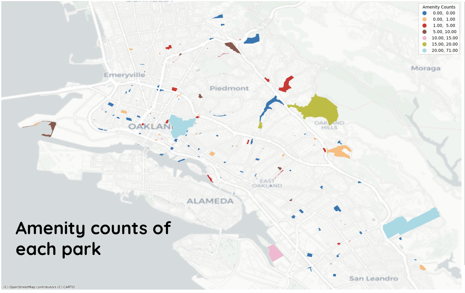
The map below shows the amenity counts of each park in Oakland. The majority of the parks in Oakland do not have any listed amenities (87, or 54% of total parks).
Park Perceptions
In addition to determining the main amenities, we also looked at the relationship between park, amenities, and reviews.
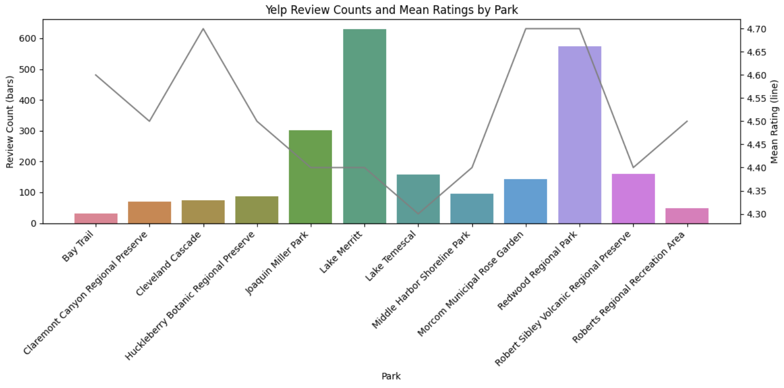
Although we only had a select number of reviews from Yelp, we wanted to see the average ratings from Yelp for each of the parks. Lake Merritt has one of the highest number reviews, but one of the lower average ratings. However, overall, all the parks reviewed in Yelp had an average rating greater than 4.30.
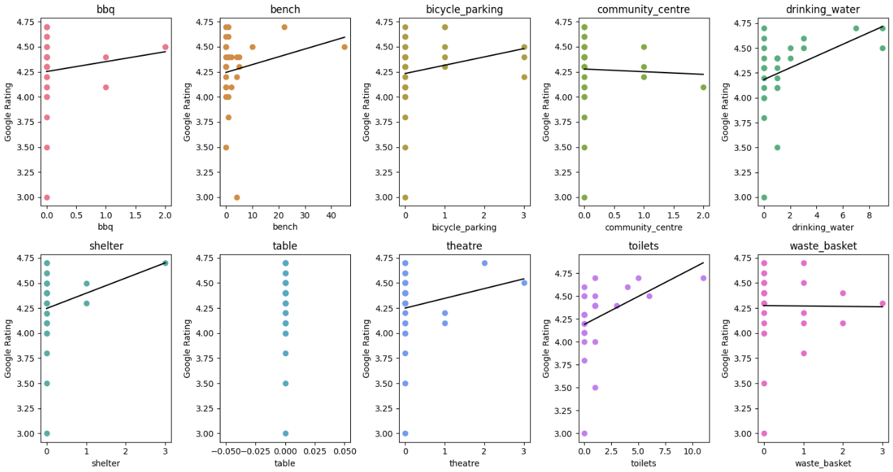
We then looked at the relationship between Google reviews and the ten amenities using linear regression. Each of the amenities had a relatively low R2; however, drinking water and toilets have a slightly higher R2at 0.167 and 0.165, respectively. When all the amenities were included in one collective model, R2 was 0.258. These results indicate that, individually, a park having a drinking water fountain or a toilet explains about 17% of the variance in park ratings. When considering the ten amenities collectively, they explain about 26% of the variance in park ratings. Overall, we found that the more amenities a park has, the higher the park rating. Specific amenities such as drinking water and toilets have a larger impact than other amenities. However, amenities like community centers and waste baskets had a negative impact. This may have occurred due to the relatively small sample size and dataset.
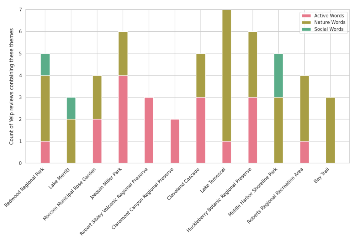
Finally, we created lists of thematic activities (active, nature, and social words) as a proxy to see what people do or find memorable at a park, and using the Yelp reviews, we counted the reviews containing those words. The figure below shows the parks and the type of activities occurring at those areas. Lake Temescal, for example, saw more nature words and one count of active words while Redwood Regional Park saw a healthier mix of activities. While a small sample size, this could be applied to a larger dataset in the future.
Park Access
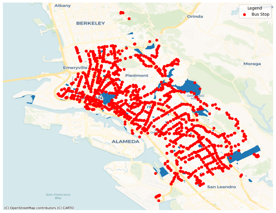
We retrieved OSM data for Oakland's bus stop locations as the first step to evaluating transit access to our study parks. The map below shows all of Oakland's bus stops in relation to all parks.
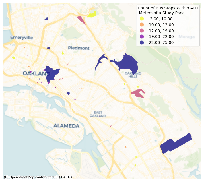
To identify which bus stops are within a walkable/accessible distance of each park, we determined a walk shed radius of 400 meters or 1/4 mile, which is consistent with the rule-of-thumb for calculating transit catchment areas. The map below illustrates the quantity of buses within this identified 400-meter buffer for each study park, with parks like Lakeside Park (75 bus stops in proximity), Dimond Canyon Park (37 bus stops in proximity), and Joaquin Miller Park (37 bus stops in proximity) with the highest counts of bus stops within a walkable distance.
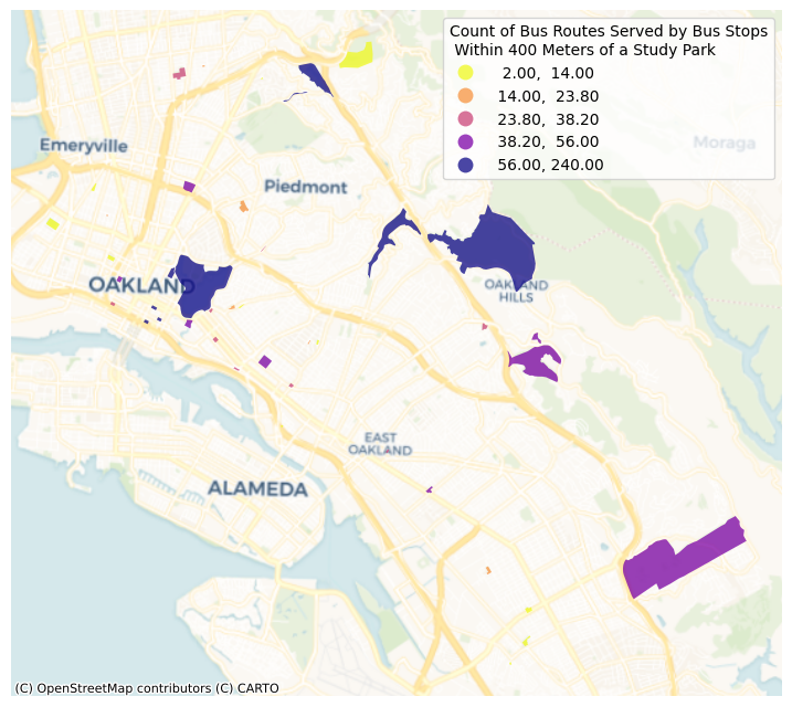
However, we deemed that it was appropriate to examine the number of bus routes that are served by each bus stop, since the quantity of bus stops does not paint the complete picture of transit accessibility. From OSM data, each bus stop's route information was retrieved and included in our analysis. The map below reveals the number of bus routes accessible within a 400-meter walk shed from each of our study parks. Some parks like Temescal Regional Recreation Area with relatively fewer bus stops in proximity (18 bus stops) ended up ranking amongst the top 5 parks based on bus routes in proximity (81 bus routes).
Park Disparities
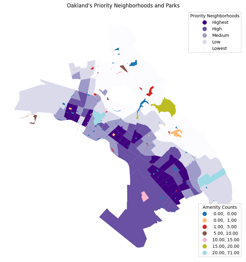
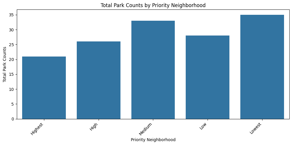
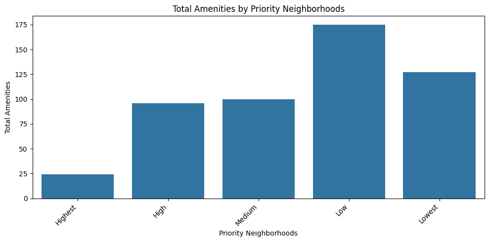
We were also curious about the spatial disparities between parks and their amenities. We mapped parks and their respective amenity count to Oakland's priority neighborhoods. The City of Oakland prioritizes neighborhoods based on areas with significant population densities determined to have experienced historic and current disparities. The priority neighborhood designations are based on sociodemographic factors such as race/ethnicity, low-income households, and people with disabilities. From our observations, we saw that parks with more amenities were typically located in low and lowest priority neighborhood.
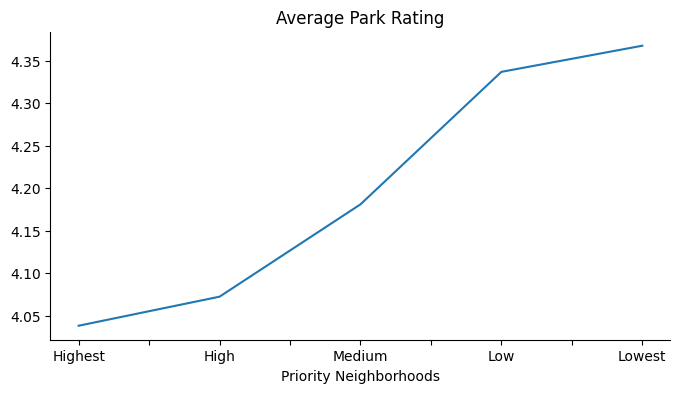
We then proceeded to look at the park counts, total amenities, and average park rating by the priority neighborhoods. Lowest priority neighborhoods had the most amount of parks and highest average rating while highest priority neighborhoods had the least amount of parks and the lowest average rating. The parks in the highest priority neighborhoods also had the least amount of amenities.
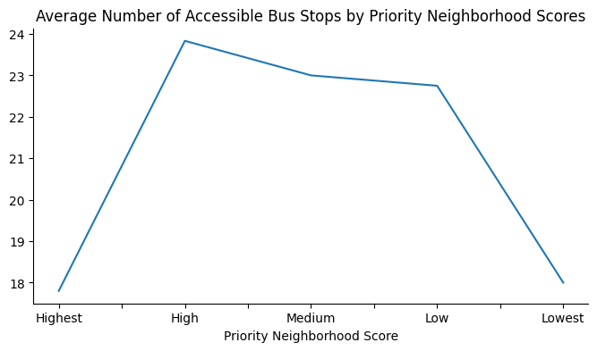
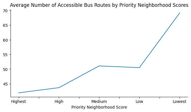
In terms of transit accessibility, a similar story is presented. Mentioned in the previous section for park access, an examination of bus stop proximity alone does not provide an accurate look at access. There is not a consistent relationship between bus stop proximity to parks and neighborhood priority scores; however, by looking at bus route proximity to parks vs. neighborhood priority scores, there was a clearer picture. Parks located in the lowest priority neighborhoods had the highest average quantity of accessible bus routes (within 400 meters), while parks located in the highest priority neighborhoods had the lowest average quantity of accessible bus routes.
As we wrap up our CYPLAN 255 experience, we'd like to reflect on our first time conducting an extensive data visualization as well as webpage development. The findings from our research are a telling initial look into disparities and public benefits shown in Oakland's park inventory, while also proving the substantial wealth of information provided by open-source data and software. We will carry and expand upon the skills and lessons we gained from this course as we progress further in our academic and professional careers. Data visualization efforts, such as this project, and similar assessments of social inequities in our built enviroment will establish a strong quantitative platform for change.
References
- Barakat & Yousufzai. 2020. Green space and mental health for vulnerable populations: A conceptual review of the evidence. https://doi.org/10.3138/jmvfh-2019-0040
- City of Oakland. nd. OakDOT Geographic Equity Toolbox. https://www.oaklandca.gov/resources/oakdot-geographic-equity-toolbox
- City of Oakland. 2018. Open Data Portal: Park Quality. https://data.oaklandca.gov/Equity-Indicators/Park-Quality/sbr3-iqtb/about_data
- Choi et al. 2022. Effect modification of greenness on the association between heat and mortality: A multi-city multi-country study. https://doi.org/10.1016/j.ebiom.2022.104251
- Google Maps. https://www.google.com/maps/
- Morphocode. nd. The 5-minute walk. https://morphocode.com/the-5-minute-walk/
- OpenStreetMap. https://www.openstreetmap.org/
- Tamosiunas et al. 2014. Accessibility and use of urban green spaces, and cardiovascular health: findings from a Kaunas cohort study. https://pubmed.ncbi.nlm.nih.gov/24645935/
- The Trust for Public Land. 2023. https://www.tpl.org/city/oakland-california
- Yelp Open Dataset. https://www.yelp.com/dataset
Check out our Github!